I recently debuted my new (to me) Chanel Desk Agenda and my disc bound planner setup for 2020 to great enthusiasm from my community. I am so glad that you all love the planner as much as I do and found inspiration in my setup. One theme that kept coming up in the comments of that video was how simple but elegant the setup was in terms of the aesthetic and decor of the planner- and that was all without relying on stickers or washing tape to make the planner “pretty.”
My planner aesthetic has certainly changed significantly over the past several years, as has the way I choose to decorate the planner itself. Where I was once drawn in by brighter colors and mixing bold patterns, adding flair to my planner with stickers, washi tape and other ephemera- now I prefer a cleaner, simpler and more elegant look. My color pallet has gone down to basic black and white with muted tones of nude and grey. I do love a pop of emerald green in the mix- used sparingly of course! But things have been refined quite a bit to create a vibe or aesthetic for my planner that aligns more with my personal style.
After all, I truly believe that although our planners are at their core, tools for our productivity, it’s important that they fit into our lives in a way that makes them inviting and exciting. I consider my planner an accessory of sorts- a living vision board of my aspirations brought to life in paper and ink, expressed in words and images. The way I feel about my goals must be reflected in the way I feel about my planner. I want to open it up each day- multiple times a day- to feel aligned with where my life is headed, excited about the things I get to do and the opportunities I’m creating for myself in my life. That’s why it’s so important for me that my planner has an intentional vibe (or vibration) in line with a specific aesthetic, because our planners can be great tools for manifestation if we let them.
So, today I want to share a few tips with you to help you create a unique vibe and aesthetic for your planner without needing to use stickers or washing tape to decorate. I know for many of us in the community- where we may have once been drawn to this ephemera, as we have progressed, it has become the content of our planners that has really taken center stage as opposed to the hobby crafting or decor. But that doesn’t mean our planners have to be bland. They can and should absolutely be beautiful and well organized as a reflection of the plans we make inside of them.
Without further ado, here are 5 ways to style your planner without stickers and washi tape.
Choose and stick to a color scheme.
The quickest way to create an intentional vibe for your planner is to define and stick to a color scheme by choosing a handful of colors that work together to tell the visual story of your planner. These colors you choose should then be used to help you decide different aspects of your planner like the color of the cover or binder, the paper and font colors used for inserts, your pen and highlight colors, and the stationery items you keep inside your planner. One comment I often receive about my planner (as well as other aspects of my life) is that “everything matches” or rather that everything coordinates. Matching is when everything is the same color/pattern, coordinating is when everything is within the same intentional scheme. The simplest way to get things to follow an aesthetic is to limit and stick to a color scheme and ensure that nothing deviates from that color scheme.

Layer textures and patterns in pockets.
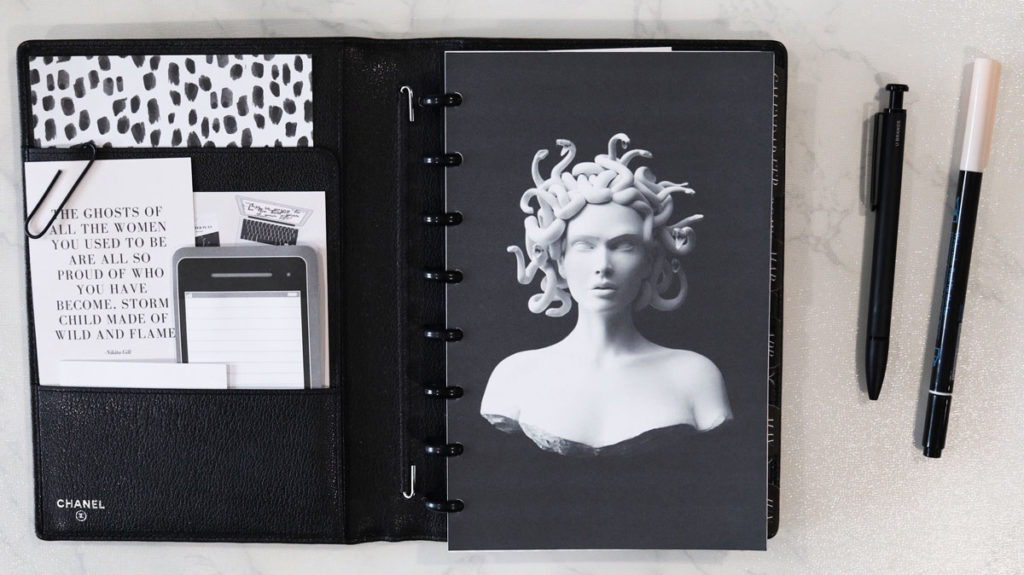
Next, let’s cover the art of layering. As with other aspects of design like fashion and home decor, layering is another technique that can be used to create a deliberate aesthetic in your planner. For this technique, you will need to rely on the organization pockets of your planner to create a three-dimensional visual experience when you open the planner up. Now this can be done in the pockets of the cover or through the use of additional pocket inserts that can be added to the front of you planner to create visual depth. Using the pockets of your planner cover as a prime example, layout a few key pieces of inspiration mixed with functional stationery within your color scheme. Keep in mind that its good to vary items by size so that each item is visible, and that working with odd numbers is always more visually appealing. So that would mean if you are decorating a pocket, choose 1, 3, 5 etc items to put in the pocket as opposed to 2 or 4. As you can see in my example, my passport pocket has 5 items of varying hight organized so that each item is layered but visible. I’m also using a paper clip to ensure that certain items stay put and don’t move around in the pocket, but this clip also adds an additional element of depth as well.

Select a cover with the right vibe.
For this tip I am referencing both the planner cover itself as well as the front dashboard of your planners inserts. These two elements of your planner are very much the first thing you see when using the planner, so it’s important that thought and intention are put into their selection. When it comes to the actual cover of the planner, it’s important that the style, color, pattern, material and even the brand of the planner itself be in line with the vibe you are aligning with. You could want a simple black leather cover and assume any black leather cover will do, but all brands and all leathers are not the same. Make sure that the quality and feel of the planner is in line with your style. Then of course, when it comes to the inner cover, or dashboard of your planner, although this element will likely be some form of paper or plastic, choose something that sends a direct message through the imagery, pattern or style. That message, of course, should be the vibe you are setting for your planner and it’s aesthetic!

Add vellum overlays throughout your planner.
An element of planner decor I have long admired but only recently began to use myself is printed vellum overlays. In one sense, they are a wonderful way to add inspiration to your planner through printed words or imagery without having to decorate inserts with stickers and washi. But what I also love about vellum overlays is that they again add a sense of dimension to your planner because depending on what you have printed on them, you can usually see the next insert in your planner underneath it. If you are someone who likes to print and add pictures or quotes to your planner, consider using vellum paper next time as it really does stand out by adding an unexpected level of interest to your inserts as you are flipping through your pages!
Fill your planner with goals and dreams that truly light you up.
I’ve said it before and I will happily say it again- if the sole purpose of my planner is to keep track of mundane life tasks and appointments, I need a planner like i need a hole in the head! I keep a planner, not to manage my time but to manage my goals! A goal is a dream with a deadline, yes? And those goals aren’t going to manifest themselves! They take a fair bit of intention, planning and execution to come to fruition and that’s where your planner comes in. No matter which planner you are using and what your planner looks like, never loose sight of the fact that your planner is the physical manifestation of your future and life story being written in real time- and that’s a serious vibe that no amount of aesthetic can ever beat!
I hope these 5 tips have inspired you to create an intentional vibe for your planner this year! I would love to hear what you thought of this information and the aesthetic that you’ll be using in your planner so please do leave me a comment below!
xoxo,

